Pre workshop instructions
Install docker: https://www.docker.com/products/docker-desktop
Pull the workshop image
docker pull mpgagebioinformatics/python_workshopRun the image and enter the container:
mdkir -p ~/python_workshop
docker run -p 8787:8787 -p 8888:8888 -v ~/python_workshop/:/home/mpiage --name python_workshop -it mpgagebioinformatics/python_workshop:latest
Start jupyterhub inside the container
module load jupyterhub
jupyter notebook --ip=0.0.0.0
Access jupyter. You will be shown a message like this:
Copy/paste this URL into your browser when you connect for the first time,
 to login with a token:
     http://b4b294d48b2b:8888/?token=01d1532b8624becc5c7b288cf0c600b7805e802349e81478&token=01d1532b8624becc5c7b288cf0c600b7805e802349e81478
Replace the "b4b294d48b2b" string (ie. bettween the http:// and :8888/) with "localhost" (eg. http://localhost:8888/?token=01d1532b8624becc5c7b288cf0c600b7805e802349e81478&token=01d1532b8624becc5c7b288cf0c600b7805e802349e81478 ) and paste it into your web browser.
If you are not able to install docker you can still run the notebook by install Python3 - https://www.python.org - and jupyter - https://jupyter.org. Afterwards make sure you have installed all required packages:
Package            Version
------------------ -------
autograd           1.2
backcall           0.1.0
bleach             2.1.3
Bottleneck         1.2.1
cycler             0.10.0
decorator          4.3.0
entrypoints        0.2.3
future             0.17.1
html5lib           1.0.1
ipykernel          4.8.2
ipython            6.4.0
ipython-genutils   0.2.0
ipywidgets         7.2.1
jedi               0.12.0
Jinja2             2.10
jsonschema         2.6.0
jupyter            1.0.0
jupyter-client     5.2.3
jupyter-console    5.2.0
jupyter-core       4.4.0
kiwisolver         1.0.1
lifelines          0.19.4
MarkupSafe         1.0
matplotlib         3.0.2
matplotlib-venn    0.11.5
mistune            0.8.3
nbconvert          5.3.1
nbformat           4.4.0
notebook           5.5.0
numpy              1.16.1
pandas             0.24.1
pandocfilters      1.4.2
parso              0.2.1
pexpect            4.6.0
pickleshare        0.7.4
pip                9.0.3
prompt-toolkit     1.0.15
ptyprocess         0.6.0
Pygments           2.2.0
pyparsing          2.3.1
python-dateutil    2.7.3
pytz               2018.9
pyzmq              17.0.0
qtconsole          4.3.1
scikit-learn       0.20.2
scipy              1.2.1
seaborn            0.9.0
Send2Trash         1.5.0
setuptools         39.0.1
simplegeneric      0.8.1
six                1.11.0
sklearn            0.0
terminado          0.8.1
testpath           0.3.1
tornado            5.0.2
traitlets          4.3.2
wcwidth            0.1.7
webencodings       0.5.1
widgetsnbextension 3.2.1
xlrd               1.2.0
Check your packages with pip3 list and install with pip3 install <package_name>==<version> --user.
You can then download the notebook start you juoyter with jupyter notebook --ip=0.0.0.0 and download the notebook from: https://github.com/mpg-age-bioinformatics/presentations-tutorials/blob/gh-pages/presentations/modules/python_workshop/python_workshop.ipynb.
Why Python?
- Easy to learn
- It's free and well documented.
- Popular (easy to get help on internet forums), big community.
- Fast !?
- Scripts are portable (can run on windows, mac os or linux).
- A lot of libraries for many applications ready to use.
Basic syntax
- Python is a “high level” script language, witch means it is as closest as possible to natural human language.
- It is possible to run commands interactively or in scripts.
- On the terminal, type python:


- Print is a function, usually in python all the functions are called by name_function()
- But before python 3, print function can be called without parenthesis ()
- Inside the parenthesis, for some functions, there are parameters, called arguments
- Inside a script:
- First line points to the python interpreter on the operational system
- And now to run (on unix based system):

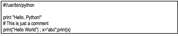
- Using # on a script, you can write comments and they will be ignored for the execution of the program
- Blank lines are ignored in a script
- It is possible to write multiple statements on a single line, separated by ;
- From now, in this workshop, we will use only iterative python or Jupyter notebook.
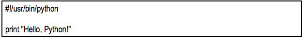
# First print on Jupyter

print("Hello, Python!")
Variables
- A variable is something which can change!!
- It is a way of referring to a memory location by a computer program.
- It stores values, has a name (identifier) and data type.
- While the program is running, the variable can be accessed, and sometimes can be changed.
- Python is not “strongly-typed” language. It means that the type of data storage on variables can be changed (other languages like C the variable should be declared with a data type).
Variables and identifiers
- Some people mistakes variables and identifiers.
- But identifiers are names of variables, they have name AND other features, like a value and data type.
- In addition, identifiers are not used only for variables, but also for functions, modules, packages, etc.
A valid identifier is a non-empty sequence of characters of any length with:
a) The start character can be the underscore "_" or a capital or lower case letter.
b) The letters following the start character can be anything which is permitted as a start character plus the digits.
c) Just a warning for Windows-spoilt users: Identifiers are case-sensitive!
d) Python keywords are not allowed as identifier names! Ex: and, as, assert, break, class, continue, def, del, elif, else, except, for, if, in, is, lambda, not, or, pass, return, try, with.
# Some example of variables

i = 30
J = 32.1

some_string= "string"
Basic Data Types summary in Python
Numerics:
- int: integers, ex: 610, 9580
- long: long integers of non-limited length (only python 2.x) <- Python 3 int is unlimited
- Floating-point, ex: 42.11, 2.5415e-12
- Complex, ex: x = 2 + 4i
Sequences:
- str: Strings (sequence of characters), ex: “ABCD”, “Hello world!”, “C_x-aer”
- list
- tuple
Boolean:
- True or False
Mapping:
- dict (dictionary)
Numbers
- int (integers): positive or negative numbers without decimal point.
a_number = 35
type(a_number)
Note that there is no “ ”. If you include quotation marks:
It is not a integer (int) but a string (str) type.
a_number = "35"
type(a_number)
long (long integers): unlimited size integer to store very big numbers with a L in the and.
Ex: 202520222271131711312111411287282652828918918181050001012021L (only Python 2.x)
a=202520222271131711312111411287282652828918918181050001012021
type(a)
a
- float (floating point real values): real numbers with decimal points (ex: 23.567) and also can be in scientific notation (1.54e2 – it is the same of 1.54 x 100 and the same of 154)
a_float_number=23.567
type(a_float_number)
another_float_number = 1.54e20
type(another_float_number)
another_float_number
another_float_number
- complex (complex numbers): not used much in Python. They are of the form a + bJ (a and b are floats) and J an imaginary number
a_complexcomplex=23.567+0j
type(a_complexcomplex)
Number type conversions
a_float_number
int(a_float_number)
a_float_number
# modifications on-fly during workshop

a_int_number = int(a_float_number)
a_int_number
complex(a_float_number)
str(a_float_number)
Hands-on:
- Create a variable numeric type float
- Convert it to a type inter
Numerical operations
- Unlike for strings, for numeric data types the operators +,*,-,/ are arithmetic
x=55
y=30
x+y
x-y
x*y
x/y # why 1 ??
float(x)/float(y)
Some extra operators:
- % (Modulus) return the remainder of a division
- ** (Exponent) return result of exponential calculation
x%y
x**y
Hands-on
- Create 3 variables with values 4, 12.4 and 30.
- Calculate the sum of all and store it into a new variable
- Multiple the result by 5 and assign it to another variable
'This is a string with single quotes'
- Wrapped with double-quote ("):
"This is a string with double quotes"
- Wrapped with three characters, using either single-quote or double-quote:
'''A String in triple quotes can extend over multiple lines, and can contain "double" quotes.'''
- A string in Python consists of a series or sequence of characters - letters, numbers, and special characters.
- Strings can be indexed. The first character of a string has the index 0.
str_1= "A string consists of characters"
str_1
str_1[0]
str_1[3]
len(str_1)
- Last character:
str_1[-1]
It is possible because the index can be also counted from the right, using negative values:
“STRING” [-6],[-5],[-4],[-3],[-2],[-1]
In addition to the normal way, from the left:
“STRING” [0],[1],[2],[3],[4],[5]
# a wrong example
#s = "Some things are immutable!"
#s[-1] = "."
Operations with strings
- Concatenation: using operator + is possible to concatenate 2 or more strings:
Attention to the absence of space
"Hello" + "World" # <- *Attention to the absence of space*
- Repetition: using operator * is possible to repeat n times one string:
"HelloWorld" * 3
- Indexing: as mentioned before, is possible to recover one specific position of the string by index:
"HelloWorld"[0]
- Slicing: it is possible to recover substring of strings with slicing notation:
"HelloWorld"[2:4] # Note that [2:4] will get the 3nd and 4rd position, not the 5th
- Size
len("HelloWorld")
type(len("HelloWorld")) # This is a int number
- Split: It is possible to use a substring (or character) to split a string:
s = "Some things are immutable!"
print(s.split()) # Default is space character
print(s.split("a"))
s2 = "You can split some strings, and you can decide how to do it!"
print(s2.split(","))
print(s2.split(",")[0])
Hands-on
- Print the 7th letter of the string "RafaelCuadrat"
- Split the names on string "Jorge,Rafael,Franziska,Daniel"
- Create a string using the 2 first and 2 last characters from the string "I love python"
- Add "ing" to the end of the string created.
Escape sequences
If you want to use some special characters with the literal meaning inside a string, you need to use backslash \ before.
Ex: “The double quotation mark is \”” -> If you use only ” without \ it will close the string without show ” inside the string
Ex2: “I like to use \” -> You need to use a backslash before a backslash to display \ inside a string
Another scape sequences using backslash include:
New line: \newline
tabular space: \t <- very important dealing with tabular files
# a wrong example
# print("This is quotes mark " in a string")
print("This is quotes mark \" in a string")
print("This is tabular t in a string")
print("This is tabular \t in a string")
Lists
- It is a versatile data type in python and can be written as comma-separated values (items) limited by [ ].
- Items in the list does not need to be of the same type!
list1 = ['physics', 'chemistry', 1997, 2000]
list2 = [1, 2, 3, 4, 5 ]
list3 = ["a", "b", "c", "d"]
- Similar to string, index of list also starts with 0 and the list can be sliced, concatenated, etc.
list1
list1[-2]
list2[0:3]
list3[2]
- Unlike strings, it is possible to update a list by changing an element:
list1[2]
list1[2] = 2001 #replacing the item on position [2] by the value 2001
list1[2]
list1
del list1[2] # deleting item on position [2] from the list (2001)
list1
List operations
- The same as string for + (concatenation) and * (repetition) and most of operators. Ex: len(list)
- More examples:
list1= ['physics', 'chemistry', 1997, 2000, 2004, 1999,2000]
len(list1)
2001 in list1
2000 in list1
list1.count(2000)
list1=[ str(s) for s in list1 ]
list1.sort()
list1
Hans-on
- From the list provided:
1 - create a new list with the lengh of each item
2 - Calculate the number of occurrences of the string "google"
list_hands_on = [11111, "python","perl","bash","R","google","microsoft","apple","google"]
tup1 = ('bla','ble','blu',1,30)
tup2 = (1,2,3,4,5,6)
tup3=(50)
Dictionary
- In the dictionary, for every item there is a key and a value, separated by colon (:)
- The items are separated by comma (,)
- Keys are unique in a dictionary, but the values may be not.
- You can access the values by the key
dict1 = {'Name': 'John', 'Age': 25, 'Class': 'First'}
dict1['Name']
dict1['Age']
Comparison and logical operators in Python
Logical:
 *and* -  both if both operators are true, the result is true
 *or*  - on of the operators is true, the result is true
 *not*  -  reverse the logical operator
Comparison:
  ==  check if two values are equal. Ex: a == b.
  !=  check if two values are NOT equal.
  >   check if the left is greater than the right. Ex: a>b.
  <   check if the left is less than right
  >=  bigger or equal
  <=  smaller or equal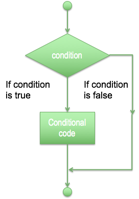
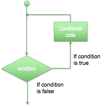
- For decision making it is possible to use just if for one single condition, if and elif for more than one condition and else for anything else (and every elif).
var1=100
if var1>90:
    print("Variable  is greater than 90")
if var1>90:
    print("Variable is greater than 90")
else:
    print("Variable can be equal or smaller than 90")
var1=90
if var1>90:
    print("Variable is greater than 90")
else:
    print("Variable can be equal or smaller than 90")
if var1>90:
    print("Variable is greater than 90")
elif var1<90:
    print("Variable is smaller than 90")
else:  #(could also be elif var1 == 90:)
    print("Variable is 90")
Loops
- Sometimes you need to repeat the same operations, so it is possible to use a loop, with a structure of repetition based in a decision or just a fixed number of times.
- For loop has the ability to iterate over the items of any sequence, such as a list or a string.
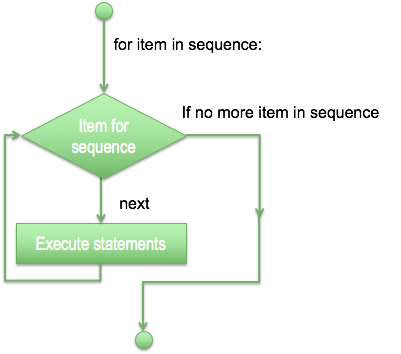
for letter in 'Python bla':
    print('Current Letter :', letter)
fruits = ["apple", "mango", "banana"]
for fruit in fruits:
    print('Current fruit :', fruit)
fruits = ["apple", "mango", "banana"]
for fruit in fruits:
    for letter in fruit:
        print('Current fruit :', fruit, 'Current letter :', letter)
- While loop statement in Python programming language repeatedly executes a target statement as long as a given condition is true.
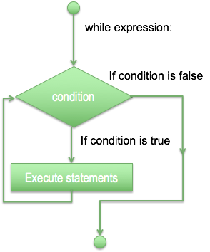
count = 0
while (count < 9):
    print("The count is:", count)
    count = count+1
print("Bye!")
- The infinite loop: you need to take care when using while loops to not create an endless loop (unless you need one).
var == 1
while var == 1:
    print "Endless loop"
- To stop it you need to use CTRL+C
Hands on:
- Create a list of words on the string "I'm learning python for bioinformatics"
- Create a loop and print all words from the list, but just if there is "n" in the word
I/O in Python
- A program (or script) needs to deal with an input and to generate an output. In Python there are many ways to input data and we will see the most basic ones first.
- The input([prompt]) function reads one line from standard input and returns it as a string (removing the trailing newline).
str_1 = input("Enter your input: ")
print("Received input is : ", str_1)
- The input([prompt]) function is equivalent to raw_input, except that it assumes the input is a valid Python expression and returns the evaluated result to you.
# str_2 = input("Enter your input: ");
# print "Received input is : ", str_2
- Before read or write a file, you have to open it with the open() function.
- This function create a file object:
afile = open("example.txt", "w+")
- The first argument is the file name, and the second is the “access mode”: It determines if the file will be only read, if can be write, append, etc. The default is r (read).
In the example, w+ is for both writing and reading, overwriting the existing file if the file exists.
Example of other modes are:
‘w’ – Write mode which is used to edit and write new information to the file (any existing files with the same name will be erased when this mode is activated)
‘a’ – Appending mode, which is used to add new data to the end of the file; that is new information is automatically amended to the end
‘r+’ – Special read and write mode, which is used to handle both actions when working with a file
afile #afile is an object
- Writing text on the new file
afile.write( "Python is amazing.\nYeah its great!!\n") # \n is new line
- Closing the file:
afile.close()
- Open, read and close a file:
fo = open("example.txt", "r+")
str_1 = fo.read()
print(str_1.endswith)
str_1.splitlines()[1]
fo = open("example.txt", "r+")
str_2 = fo.read();
print(str_2)
fo.close()
fo.close()
### include fasta file reading and manupulations
Functions
- A function is a block of organized, reusable code that is used to perform a single, related action. Functions provide better modularity for your application and a high degree of code reusing.
- As you already know, Python gives you many built-in functions like print(), etc. but you can also create your own functions. These functions are called user-defined functions.
- You can define functions to provide the required functionality.
- Function blocks begin with the keyword def followed by the function name and parentheses ( ):
def a_new_function():
    print("A new function")
    return
a_new_function()
- Any input parameters or arguments should be placed within these parentheses. You can also define parameters inside these parentheses.
- The first statement of a function can be an optional statement - the documentation string of the function or docstring.
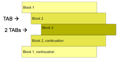
- The code block within every function starts with a colon (:) and is indented.
- The statement return [expression] exits a function, optionally passing back an expression to the caller. A return statement with no arguments is the same as return None.
def a_new_function(a_str):
    print(a_str)
    return
a_new_function("another string")
- It is possible to use arguments as keyword arguments. It allows you to skip arguments or place out of order because python will identify by the keyword
# Function definition is here
def printinfo( name, age ):
    "This prints a passed info into this function"
    print("Name: ", name)
    print("Age ", age)
    return;
# Now you can call printinfo function - no keyword, but same order
printinfo("miki",50)
printinfo(50,"miki")
# Now you can call printinfo function - using the keywords
printinfo(age=50,name="miki")
- How to get help:
help(printinfo)
- It is possible to use default arguments:
def printinfo( name, age = 35 ): # default argument age is 35
    "This prints a passed info into this function"
    print("Name: ", name)
    print("Age ", age)
    return;
printinfo( name="miki" ) # no age argument, it will be the default
- The statement return [expression] exits a function, optionally passing back an expression to the caller. A return statement with no arguments is the same as return None.
def sum_( arg1, arg2 ):
   # Add both the parameters and return them."
    total = arg1 + arg2
    print("Inside the function : ", total)
    return total;
sum_( 10, 20 )
Global vs. Local variables:
- Variables that are defined inside a function body have a local scope, and those defined outside have a global scope.
total = 0 # Global variable.
def sum_2( arg1, arg2 ):
    # Add both the parameters and return them."
    total = arg1 + arg2; # Local variable.
    print("Inside the function local total : ", total)
    return
sum_2( 10, 20 );
print("Outside the function global total : ", total )
Modules
- A module allows you to logically organize your Python code. Grouping related code into a module makes the code easier to understand and use.
- A module is a Python object with arbitrarily named attributes that you can bind and reference.
- Simply, a module is a file consisting of Python code. A module can define functions, classes and variables. A module can also include runnable code.
- The Python code for a module named aname normally resides in a file named aname.py. Here's an example of a simple module, support.py
def print_func( name ):
    print("Hello : ", name)
    return
# Creating a module on fly - just illustrative, never do it, use a text editor or IDE
new_mod=open("support.py","w+")
new_mod.write("def print_func( name ):\n\tprint(\"Hello : \", name)\n\treturn")
new_mod.close()
To use a module you need first to import:
# Import module support
import support

# Now you can call defined function that module as follows
support.print_func("Zara")
You can also use an alias for the module:
# Import module support with an alias “sup”
import support as sup
sup.print_func("Zara")
Hands-on
- Write a Python function that takes a list of words and returns the length of the longest one.
Questions ???

Second Day workshop
- Numerical operations (Numpy)
- Dataframes (pandas)
- Plots (matplotlib and seaborn)
Numerical operations with Numpy
- Numpy is the core library for scientific computing in Python. It provides a high-performance multidimensional array object, and tools for working with these arrays (including many numerical operations)
- We will not cover arrays in detail, but we will see how to use numpy to do numerical operations
- NumPy’s array class is called ndarray. It is also known by the alias array. Note that numpy.array is not the same as the Standard Python Library class array.array, which only handles one-dimensional arrays and offers less functionality.
import numpy as np
a = np.arange(15).reshape(3,5)
a
a = np.array([2,3,4])
b = np.array([2.1,3.2,4.5])
Operations with Numpy
c=a+b
c
d=a-b
d
d**2
a*b # Element wise product
a.dot(b) # Matrix product
e=np.arange(12).reshape(3,4)
e
e.sum(axis=0)
e.sum(axis=1)
e.min(axis=0)
e.min(axis=1)
e.max(axis=1)
e.cumsum(axis=1)
e.T
e[2,3]
e[-1]
Hands-on
- with the 2 provided arrays:
1 - reshape both to 3 rows and 4 columns
2 - Transpose both
3 - calculate the sum of the cumsum of both arrays
anewarray=np.random.rand(4,3)
anotherarray=np.random.rand(4,3)
- In general, we import a tabular or CSV file to a pandas dataframe
- The are some options, for example, we can use different separator character, we can read a file with or without a header
import pandas as pd


df=pd.read_csv("new_AVS.tsv")
df.head()
#checking the first rows of dataframe - It shows 5 rows by default, but you can pass argument inside ()
df.head()
df.tail() # Last 5 rows
- By default, function read_csv() would use "," as separator to read the table.
- We can change it for any carachter, for example tabular "\t":
df=pd.read_csv("new_AVS.tsv",sep="\t")
df.head()
- It's also possible to read excel tables using read_excel("file.xls")
df_cog=pd.read_excel("CAMERA_COG_RPKG_sig.xlsx")
This table stores the normalized abundance of each COG (ortholog genes) on each sample
df_cog.head(10)
df=pd.read_csv("new_AVS.tsv",sep="\t")
This file is a parsed output from MicrobeCensus software:
https://github.com/snayfach/MicrobeCensus
MicrobeCensus is a fast and easy to use pipeline for estimating the average genome size (AGS) of a microbial community from metagenomic data.
df.head()
- The samples used on this study are from GOS - baltic sea.
Checking the column names:
df.columns
l=list(df.columns)
l
Subseting a dataframe:
For us, its only important now 2 columns
new_df=df[["metagenome:","average_genome_size:","genome_equivalents:"]]
new_df.head()
Rename columns (all):
new_df.columns=["Sample","AGS","GE"]
new_df.head()
Rename specific columns:
new_df.rename(columns= {"Sample":"sample"},inplace=False).head() #Needs inplace = True to really change it
Working with index on dataframes:
- this will set index and display the new_df with new index, but no alterations to original dataframe:
new_df.set_index("Sample").head() #Just show the dataframe with the index on "Sample",
                                  # no alterations to original df
#Original still unchanged
new_df.head()
new_df.set_index("Sample",inplace=True) # inplace=True modifies the dataframe
# Now its changed
new_df.head()
General statistic on dataframe:
new_df.describe()
Get the min value from GE:
new_df["GE"].min()
Get the min value from all columns:
new_df.min()
new_df.max()
new_df.dtypes
type(new_df)
Transpose dataframe:
new_df.T
#some hands on here
Sort by values in one column (in this case, GE):
new_df.sort_values(by="GE").head()
By default it will sort ascending values, but you can specify to be descending:
new_df.sort_values(by="GE",ascending=False).head()
Selecting one column as Pandas Series:
new_df["AGS"].head()
Selecting one column as new Pandas DataFrame:
new_df[["AGS"]].head()
Slicing by rows (positional):
new_df.iloc[0:3]
Slicing by rows (by index name):
new_df.loc["CAM_SMPL_003398":"CAM_SMPL_003418"]
Conditional selection:
new_df[(new_df["GE"]<40) & (new_df["AGS"]>1000000)][["AGS"]].head()
new_df[new_df["GE"]>40] # Select the rows where GE is bigger than 40
Operations with the values:
new_df.max()-new_df.min()
Create a new column based on results of operations:
new_df["GE - AGS"]=new_df["GE"]-new_df["AGS"]
new_df.head()
Delete a column:
del new_df["GE - AGS"]
new_df.head()
new_df["AGS - GE"]=new_df["AGS"]-new_df["GE"]
More about Pandas in: http://pandas.pydata.org/
Cheat Sheet: http://pandas.pydata.org/Pandas_Cheat_Sheet.pdf
Hands on:
- read a dataframe (any!! From internet, from your computer...)
- print the columns
- store the column names into a list
- print the max value from the last column
- print the max value from the last row
Plots with matplotlib
- Matplotlib is a Python 2D plotting library which produces publication quality figures in a variety of hardcopy formats and interactive environments across platforms. Matplotlib can be used in Python scripts, the Python and IPython shells, the Jupyter notebook, web application servers, and four graphical user interface toolkits.
https://matplotlib.org/
import matplotlib.pyplot as plt
- Seaborn is a Python visualization library based on matplotlib. It provides a high-level interface for drawing attractive statistical graphics.
https://seaborn.pydata.org/
import seaborn as sns
Starting with plots - the ugly and lazy way
#function plot direct from pandas dataframe
new_df["GE"].plot()
plt.show()

#Rotate the name of samples

new_df["GE"].plot()


plt.xticks(rotation=90)

plt.show()

This plot is useless, we dont have continuos data, we need a bar plot in this case
new_df["GE"].plot(kind="bar")  # kind can be also pie, scatter, etc ...
plt.xticks(rotation=90)
plt.show()

We need to control the size and style of figure, and also axis titles, etc
sns.set_style("white")

#Define a figure and its size
plt.figure(figsize=(15,8))


#Bar plot

# range(len(new_df["AGS"])) -> define the number of bars to be plotted and the position on X axis
x=range(len(new_df["AGS"]))

# new_df["AGS"] -> values for axis Y
y=new_df["AGS"]

plt.bar(x,y,color="b")

#axis labels
plt.ylabel("AGS ",fontsize="16")
plt.xlabel("Samples",fontsize="16")

plt.title("PLOT FOR WORKSHOP",fontsize="22")
#xticks -> define the text to be ploted on axis X -> here we use index (the name of samples)


### error .... index values not matching the positions of xticks

plt.xticks(range(0,len(new_df.index),2), new_df.index,rotation="vertical",fontsize="12")
plt.yticks(fontsize="22")

## Save the figure in pdf

plt.savefig("my_first_plot.pdf", format = 'pdf', dpi = 300, bbox_inches = 'tight')

#Necessary to display the plot here
plt.show()

More about seaborn styles in: https://seaborn.pydata.org/generated/seaborn.set_style.html
The values on Y are in bases, hard to read, so we can convert to Mb
new_df["AGS (mb)"]=new_df["AGS"]/1000000
#Seaborn style
sns.set_style("white")

#Define a figure and its size
plt.figure(figsize=(15,8))


x=range(len(new_df["AGS (mb)"]))

y=new_df["AGS (mb)"]


#Bar plot
plt.bar(x,y,color="b")

#axis labels
plt.ylabel("AGS (Mb)",fontsize="16")
plt.xlabel("Samples",fontsize="16")


plt.xticks(range(len(new_df.index)), new_df.index,rotation="vertical")

plt.show()

Metadata from samples
df2=pd.read_csv("metatable.csv", encoding = "latin")
df2.head()
new_df.head()
new_df.reset_index(inplace=True)
new_df.head()
# checking size of both dataframes, if they have same number of samples
len(new_df)
len(df2)
#mergeing 2 df
merged=pd.merge(new_df,df2,left_on="Sample",right_on="SAMPLE_ACC")
merged.head(15)
l1=list(merged.columns)
#removing columns - (axis 1) -  where ALL the values are NaN (null, missing)
merged.dropna(how="all",axis=1,inplace=True)
merged.head()
l2=list(merged.columns)
[x for x in l1 if x not in l2]
Sort values by filter size:
merged=merged.sort_values("FILTER_MIN")
merged.head(10)
merged.reset_index(inplace=True,drop=True)
merged.head(10)
Creating 3 groups (g1, g2, g3) for each filter_min size
merged["FILTER_MIN"].drop_duplicates()
g1_ = merged[merged["FILTER_MIN"]==0.1]
g2_ = merged[merged["FILTER_MIN"]==0.8]
g3_ = merged[merged["FILTER_MIN"]==3.0]
# Group by and calculating the mean of each group

list(merged.groupby("FILTER_MIN")["AGS (mb)"].mean())
Hands-on:
- plot a barplot from with GE columns only for g1 (FILTER_MIN = 0.1).
- Add the legend of axis x (xticks) with 45 degrees rotation, using name of samples
Creating more complicated bar plots:
- ploting 3 groups (g1, g2 and g3), different colors, and a line defining the average value for each group
sns.set_style("white")

plt.figure(figsize=(15,10))

#Here we are ploting on the same figure, 3 bar plots, ranging from the original index obtained from the merged dataframe

plt.bar(g1_.index,g1_["AGS (mb)"],color="b") # -> color b=blue, each bar plot we use different colors

plt.bar(g2_.index,g2_["AGS (mb)"],color="c")

plt.bar(g3_.index,g3_["AGS (mb)"],color="r")

plt.ylabel("AGS (mb)",size="16")
plt.xticks(range(len(merged)), merged["Sample"], size='small',rotation="vertical")
plt.legend(merged["FILTER_MIN"].drop_duplicates())

#here we plot 3 horizontal lines (hlines) with the mean of AGS values for each group
plt.hlines(g1_["AGS (mb)"].astype(float).mean(),g1_.index[0],g1_.index[-1])
plt.hlines(g2_["AGS (mb)"].astype(float).mean(),g2_.index[0],g2_.index[-1])
plt.hlines(g3_["AGS (mb)"].astype(float).mean(),g3_.index[0],g3_.index[-1])
plt.show()

Starting with seaborn, using hue and crating more fancy plots
sns.set_style("white")

plt.figure(figsize=(15,10))
x=merged.index
y="AGS (mb)"
sns.barplot(x=x,y=y,hue="FILTER_MIN",data=merged)
plt.xticks(range(len(x)), merged["Sample"], size='small',rotation="vertical")

plt.show()

Hands-on:
- add the mean values line to the previous plot
Barplot with error bars, violinplot and boxplots
sns.set_style("white")

plt.figure(figsize=(15,10))
x=merged["FILTER_MIN"]
y=merged["AGS (mb)"]
sns.barplot(x,y)
plt.show()

sns.set_style("white")

plt.figure(figsize=(15,10))
x=merged["FILTER_MIN"]
y=merged["AGS (mb)"]
sns.violinplot(x,y)
plt.show()

sns.set_style("white")

plt.figure(figsize=(15,10))
x=merged["FILTER_MIN"]
y=merged["AGS (mb)"]
sns.boxplot(x,y)
plt.show()

Hands on:
- create the same violin plots, but adding dots on the plot
- create violin plots for sample volume, instead filter min
Exploring data, checking correlations
#correlation between 2 variables

merged[["AGS (mb)","temperature - (C)"]].corr()
Do you think AGS (average genome size) are correlated with temperature?
#Doing a scatter plot

sns.set_style("white")
x=merged["AGS (mb)"]
y=merged["temperature - (C)"]
plt.figure(figsize=(15,10))
plt.scatter(x,y)
plt.ylabel("temperature - (C)",size="16")
plt.xlabel("AGS (mb)",size="16")
plt.show()

sns.jointplot("temperature - (C)", "AGS (mb)", data=merged, kind="reg",
                  xlim=(0, 20), ylim=(0, 3), color="r", size=7)
plt.show()

sns.jointplot("LATITUDE", "AGS (mb)", data=merged, kind="reg",
                  xlim=(0, 20), ylim=(0, 3), color="r", size=7)
plt.show()

Hands on:
- plot correlation plot with other variables
Heatmaps
- Working with genes abundance on samples
df_cog.index=df_cog["Unnamed: 0"].tolist()
df_cog=df_cog.drop(["Unnamed: 0"], axis=1)
# Remove rows only with 0
df_2=df_cog[(df_cog.T != 0).any()]
df_2.columns
len(df_cog) # number of cogs (gene ortologs groups) on the original table
len(df_2) # number of cogs after removing those with 0 abundance in all the samples
# New dataframe only with the RPKG for all the samples

heat=df_2[[x for x in df_2.columns if "CAM_SMPL"in x ]]
heat.head()
##test.ix[:, test.columns != 'compliance']
sns.clustermap(heat,figsize=(12,25),cbar_kws={'label': 'COGs RPKG'},yticklabels=False)
#plt.savefig("../clustermap_cogs.pdf", format = 'pdf', dpi = 300, bbox_inches = 'tight')
plt.show()

# customizing colors
import matplotlib.cm as cm
from  matplotlib.colors import LinearSegmentedColormap
c = ["pink","lightcoral","red","darkred","black"]
v = [0,.25,.5,.75,1.]
l = list(zip(v,c))
cmap=LinearSegmentedColormap.from_list('rg',l, N=1024)
sns.clustermap(heat,figsize=(12,25),cbar_kws={'label': 'COGs RPKG'},yticklabels=False,cmap=cmap)
#plt.savefig("../clustermap_cogs.pdf", format = 'pdf', dpi = 300, bbox_inches = 'tight')
plt.show()

heat_log= heat.apply(lambda x: np.log10(x+0.001))
c = ["darkred","red","lightcoral","white","palegreen","green","darkgreen"]
v = [0,.15,.4,.5,0.6,.9,1.]
l = list(zip(v,c))
cmap=LinearSegmentedColormap.from_list('rg',l, N=1024)
sns.clustermap(heat_log,figsize=(12,25),cbar_kws={'label': 'log2(COGs RPKG)'},yticklabels=False,cmap=cmap)
#plt.savefig("../clustermap_cogs.pdf", format = 'pdf', dpi = 300, bbox_inches = 'tight')
plt.show()

Hands-on:
- Plot the same heatmaps, but only for genes where pvalue adjusted < 0.01
- plot a heatmap for z-score
Getting upregulated COGs in the comparisons of different filtrations methods groups
a=set(df_2[df_2["log2(FC)_g1/g3"]>0].index)
b=set(df_2[df_2["log2(FC)_g1/g2"]>0].index)
c=set(df_2[df_2["log2(FC)_g2/g3"]>0].index)
To install matplotlib_venn:
pip install --user matplotlib-venn
- more info about the package in https://pypi.org/project/matplotlib-venn/
from matplotlib_venn import venn3,venn3_unweighted
plt.figure(figsize=(10,10))


vd = venn3_unweighted([a, b,c], ('up g1/g3', 'up g1/g2','up g2/g3'))

plt.show()

plt.figure(figsize=(10,10))


vd = venn3([a, b,c], ('up g1/g3', 'up g1/g2','up g2/g3'))

plt.show()

Hands-on
- Plot a heatmap for log2(FC) up regulated genes for the 3 comparions (g1/g2, g2/g3 and g1/g3)
PCA - Principal component analysis
Very nice expanation about PCA: https://stats.stackexchange.com/questions/2691/making-sense-of-principal-component-analysis-eigenvectors-eigenvalues
Package sklearn - more info at http://scikit-learn.org/stable/index.html
from sklearn import preprocessing
from sklearn.decomposition import PCA
from itertools import cycle
heat.head(2)
len(heat)
# we have 164 COGs, that means, we have 164 variables to be transformed to 2 (or more) dimensions
df_pca=heat.T.reset_index()
df_pca.head()
merged.head()
df_pca=pd.merge(merged[["Sample","FILTER_MIN"]],df_pca,left_on="Sample",right_on="index").drop("index",axis=1)
df_pca.set_index(["Sample","FILTER_MIN"],inplace=True)
df_pca.head()
pca = PCA(copy=True, iterated_power='auto', n_components=2, random_state=None,
  svd_solver='auto', tol=0.0, whiten=False)

#scaling the values
df_pca_scaled = preprocessing.scale(df_pca)

projected=pca.fit_transform(df_pca_scaled)
print(pca.explained_variance_ratio_)
tmp=pd.DataFrame(projected)
tmp.rename(columns={0: 'Component 1',1: 'Component 2'}, inplace=True)
tmp.head()
final_pca=pd.merge(df_pca.reset_index(),tmp,left_index=True,right_index=True)
# in the final_pca dataframe, in adition to all the COGs,
# we have new columns (0 and 1), with the PCA results (2 components)
final_pca.head()
sns.set_style("white")
color_gen = cycle(('blue', 'green', 'red'))
plt.figure(figsize=(10,10))
for lab in set(final_pca["FILTER_MIN"]):
    plt.scatter(final_pca.loc[final_pca['FILTER_MIN'] == lab, 'Component 1'],
                final_pca.loc[final_pca['FILTER_MIN'] == lab, 'Component 2'],
                c=next(color_gen),
                label=lab)


plt.xlabel('component 1  - ' + str(pca.explained_variance_ratio_[0]*100)+ " % " )
plt.ylabel('component 2  - '+ str(pca.explained_variance_ratio_[1]*100)+ "  % " )
plt.legend(loc='best')
plt.show()

#pca.components_
components = pd.DataFrame(pca.components_, columns = df_pca.columns, index=[1, 2])
# Principal axes in feature space, representing the directions of maximum variance in the data.
components
import math

def get_important_features(transformed_features, components_, columns):
    """
    This function will return the most "important"
    features so we can determine which have the most
    effect on multi-dimensional scaling
    """
    num_columns = len(columns)

    # Scale the principal components by the max value in
    # the transformed set belonging to that component
    xvector = components_[0] * max(transformed_features[:,0])
    yvector = components_[1] * max(transformed_features[:,1])

    # Sort each column by it's length. These are your *original*
    # columns, not the principal components.
    important_features = { columns[i] : math.sqrt(xvector[i]**2 + yvector[i]**2) for i in range(num_columns) }
    important_features = sorted(zip(important_features.values(), important_features.keys()), reverse=True)
    return important_features,xvector,yvector
important_features,xvector,yvector=get_important_features(projected, pca.components_, df_pca.columns.values)
def draw_vectors(transformed_features, components_, columns):
    """
    This funtion will project your *original* features
    onto your principal component feature-space, so that you can
    visualize how "important" each one was in the
    multi-dimensional scaling
    """

    num_columns = len(columns)

    # Scale the principal components by the max value in
    # the transformed set belonging to that component
    xvector = components_[0] * max(transformed_features[:,0])
    yvector = components_[1] * max(transformed_features[:,1])

    # Sort each column by it's length. These are your *original*
    # columns, not the principal components.
    important_features = { columns[i] : math.sqrt(xvector[i]**2 + yvector[i]**2) for i in range(num_columns) }
    important_features = sorted(zip(important_features.values(), important_features.keys()), reverse=True)

    ax = plt.axes()

    tmp=pd.DataFrame({"xvector":xvector,"columns":columns} )
    tmp2=pd.DataFrame({"yvector":yvector,"columns":columns} )


    azip=zip(xvector,columns)
    azip2=zip(yvector,columns)
    col_array=[]

    # Use an arrow to project each original feature as a
    # labeled vector on your principal component axes
    for i in range(num_columns):

        if columns[i]==tmp[tmp["xvector"]==max(xvector)]["columns"].tolist()[0]:
            plt.arrow(0, 0, xvector[i], yvector[i], color='b', width=0.0005, head_width=0.02, alpha=0.75)
            plt.text(xvector[i]*1.2, yvector[i]*1.2, list(columns)[i], color='b', alpha=0.75)
            col_array.append(columns[i])
        if columns[i]==tmp[tmp["xvector"]==min(xvector)]["columns"].tolist()[0]:
            plt.arrow(0, 0, xvector[i], yvector[i], color='b', width=0.0005, head_width=0.02, alpha=0.75)
            plt.text(xvector[i]*1.2, yvector[i]*1.2, list(columns)[i], color='b', alpha=0.75)
            col_array.append(columns[i])
        if columns[i]==tmp2[tmp2["yvector"]==min(yvector)]["columns"].tolist()[0]:
            plt.arrow(0, 0, xvector[i], yvector[i], color='b', width=0.0005, head_width=0.02, alpha=0.75)
            plt.text(xvector[i]*1.2, yvector[i]*1.2, list(columns)[i], color='b', alpha=0.75)
            col_array.append(columns[i])

    return ax,col_array
color_gen = cycle(('red', 'green', 'blue'))
plt.figure(figsize=(10,10))
for lab in set(final_pca["FILTER_MIN"]):
    plt.scatter(final_pca.loc[final_pca['FILTER_MIN'] == lab, 'Component 1'],
                final_pca.loc[final_pca['FILTER_MIN'] == lab, 'Component 2'],
                c=next(color_gen),
                label=lab,alpha=0.8)

ax,cols=draw_vectors(projected, pca.components_, df_pca.columns.values)

plt.xlabel('Component 1  - ' + str(pca.explained_variance_ratio_[0]*100)+ " % " )
plt.ylabel('Component 2  - '+ str(pca.explained_variance_ratio_[1]*100)+ "  % " )
plt.legend(loc='best')
plt.show()

Hands-on:
- Plot the same PCA, but fixing the text on arrows (keeping only COG number, removing the descriptions)
- Add a vertical line and a horizontal line on zero values
Plotting the 4 COGs with extreme vectors on PCA
sns.set_style("white")
plt.figure(figsize=(15,10))
tmp=final_pca[final_pca['Sample'].isin(g1_["Sample"])]
tmp2=final_pca[final_pca['Sample'].isin(g2_["Sample"])]
tmp3=final_pca[final_pca['Sample'].isin(g3_["Sample"])]
for c in cols:
    plt.figure(figsize=(15,10))
    plt.bar(tmp.index,tmp[c],color="b")
    plt.bar(tmp2.index,tmp2[c],color="g")
    plt.bar(tmp3.index,tmp3[c],color="r")
    plt.ylabel(c,size="12")
    plt.xticks(range(len(final_pca)), final_pca["Sample"], size='small',rotation="vertical")
    plt.legend(final_pca["FILTER_MIN"].drop_duplicates())

    #here we plot 3 horizontal lines (hlines) with the mean of AGS values for each group
    plt.hlines(tmp[c].astype(float).mean(),g1_.index[0],g1_.index[-1])
    plt.hlines(tmp2[c].astype(float).mean(),g2_.index[0],g2_.index[-1])
    plt.hlines(tmp3[c].astype(float).mean(),g3_.index[0],g3_.index[-1])
    plt.show()


sns.set_style("white")

for c in cols:
    plt.figure(figsize=(15,10))
    x=final_pca["FILTER_MIN"]
    y=final_pca[c]
    sns.violinplot(x,y)
plt.show()


## Kmeans

## clusterization (kmeans with euc distance)
## calculate distance btw centroid of clusters and each gene
## plot bar plots for the genes with shorter and bigger distance from one cluster

### a bit more about K-means: https://datasciencelab.wordpress.com/2013/12/12/clustering-with-k-means-in-python/
def dist(a, b, ax=1):
    return np.linalg.norm(a - b, axis=ax)
f1 = final_pca["Component 1"].values
f2 = final_pca["Component 2"].values
X = np.array(list(zip(f1, f2)))
plt.scatter(f1, f2, c='black', s=15)
plt.show()

from sklearn.cluster import KMeans
from scipy.spatial.distance import cdist
# k means determine k
distortions = []
K = range(1,10)
for k in K:
    kmeanModel = KMeans(n_clusters=k).fit(X)
    kmeanModel.fit(X)
    distortions.append(sum(np.min(cdist(X, kmeanModel.cluster_centers_, 'euclidean'), axis=1)) / X.shape[0])

# Plot the elbow
plt.plot(K, distortions, 'bx-')
plt.xlabel('k')
plt.ylabel('Distortion')
plt.title('The Elbow Method showing the optimal k')
plt.show()

from sklearn.cluster import KMeans

# Number of clusters
k=3
kmeans = KMeans(n_clusters=k)
# Fitting the input data
kmeans = kmeans.fit(X)
# Getting the cluster labels
labels = kmeans.predict(X)
# Centroid values
C = kmeans.cluster_centers_
print(C)
from copy import deepcopy
# colors = ['#FF0000', 'g', '#FF7D40', '#66CDAA', '#473C8B', '#9400D3','#8B8386','#FFC0CB','#B0171F']
# fig, ax = plt.subplots()
# for i in range(k):
#         points = np.array([X[j] for j in range(len(X)) if clusters[j] == i])
#         ax.scatter(points[:, 0], points[:, 1], s=15, c=colors[i])
# ax.scatter(C[:, 0], C[:, 1], marker='*', s=100, c='#050505')
# plt.show()
kmeans.labels_
final_pca.head()
from sklearn.metrics import pairwise_distances_argmin_min
closest, _ = pairwise_distances_argmin_min(kmeans.cluster_centers_, X)
closest
final_pca.loc[[34]]
final_pca.loc[[13]]
final_pca.loc[[60]]
Hands-on:
- Try the kmeans clusterization with different number of cluters (4 and 5)
Lifespan analysis
lifelines package: http://lifelines.readthedocs.io/en/latest/
from lifelines.datasets import load_waltons
df = load_waltons() # returns a Pandas DataFrame

print(df.head())


T = df['T']
E = df['E']
- T is an array of durations, E is a either boolean or binary array representing whether the “death” was observed (alternatively an individual can be censored).
from lifelines import KaplanMeierFitter
kmf = KaplanMeierFitter()
kmf.fit(T, event_observed=E)  # or, more succiently, kmf.fit(T, E)
kmf.survival_function_
kmf.median_
kmf.plot()
plt.show()

groups = df['group']
ix = (groups == 'miR-137')

kmf.fit(T[~ix], E[~ix], label='control')
ax = kmf.plot()

kmf.fit(T[ix], E[ix], label='miR-137')
kmf.plot(ax=ax)
plt.show()

from lifelines.statistics import logrank_test

results = logrank_test(T[ix], T[~ix], E[ix], E[~ix], alpha=.99)

results.print_summary()
from lifelines.datasets import load_regression_dataset
regression_dataset = load_regression_dataset()

regression_dataset.head()
from lifelines import CoxPHFitter

# Using Cox Proportional Hazards model
cph = CoxPHFitter()
cph.fit(regression_dataset, 'T', event_col='E')
cph.print_summary()
cph.plot()
plt.show()
